
Chayan Seth
Solar Energy Professional
Using Data Analytics to Improve Solar Plant Performance
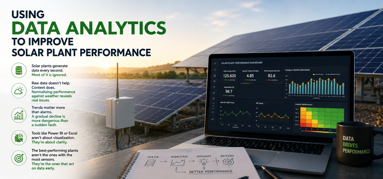
Solar plants generate data every second. Most of it is ignored.
A modern solar plant can produce huge amounts of information from inverters, weather stations, meters, SCADA systems, data loggers and monitoring platforms. But having all this data does not automatically mean that the plant is being managed efficiently.
The real value starts when the data is converted into something that helps us make a decision.
One of the first things I look at is performance in context. A plant generating less energy today does not necessarily mean that something is wrong. Irradiation may be lower, the temperature may be higher, or there may have been cloud cover. Simply comparing today’s generation with yesterday’s number can therefore be misleading.
This is where normalization becomes important. Performance can be compared against irradiation, temperature and other operating conditions to understand whether the plant is actually performing below its potential.
For example, if two inverters receive similar irradiation but one consistently produces less energy, that difference deserves attention. The same applies to a gradual decline in performance ratio or specific yield. These trends can sometimes tell us about a developing problem before the equipment generates a major alarm.
And this is something I have found particularly important: trends often tell more than alarms.
An inverter trip is obvious. Someone will investigate it because there is an alarm. A slow decline of 2–3% over several months is much easier to miss. But over the life of a solar plant, that gradual decline can represent a significant amount of lost generation.
This is where tools such as Power BI and Excel become useful. For me, they are not primarily visualization tools. Their real value is in bringing scattered information together and making patterns easier to see.
A good dashboard should answer practical questions:
- Which inverter is consistently underperforming?
- Is generation falling compared with the expected irradiation?
- Which equipment has the highest downtime?
- Are certain faults repeating?
- Is plant performance improving or deteriorating?
- Where should the O&M team investigate first?
The objective is not to create a dashboard with twenty different graphs. It is to make the important information difficult to miss.
Another useful approach is comparing similar assets. If several inverters operate under almost identical conditions, their performance can be benchmarked against each other. One unusual performer can then be investigated rather than waiting for it to fail completely.
Data analytics can also improve maintenance decisions. Instead of following a purely reactive approach—waiting for a fault and then fixing it—historical data can help identify equipment that is gradually moving away from normal behavior.
Of course, analytics is only as good as the data behind it. Incorrect sensor readings, missing data, poor calibration or inconsistent time intervals can lead to completely wrong conclusions. Data quality therefore has to be treated as part of plant management, not as an IT problem.
Ultimately, the best-performing solar plants are not necessarily the ones with the most sensors or the most complicated monitoring systems.
They are the plants where someone looks at the data, understands the context, identifies the deviation and acts early.
Data by itself is just information.
Data + context + action is what improves performance.